리액트에서 select ui를 원하는모양으로 커스터마이징해보자
기본 html <select>를 그대로 이용하지 않고 리액트 material-ui에서 제공하는 styled-components를 사용해서 component별로 커스텀화해서 사용하고 있다.
style.js
import styled from "styled-components";
import './style.css';
import Box from '@mui/material/Box';
import Button from '@mui/material/Button';
import Typography from '@mui/material/Typography';
import FormControl from '@mui/material/FormControl';
import Input from '@mui/material/Input';
import InputLabel from '@mui/material/InputLabel';
import Select, { SelectChangeEvent } from '@mui/material/Select';
import MenuItem from '@mui/material/MenuItem';
import Checkbox from '@mui/material/Checkbox';
import Radio from '@mui/material/Radio';
import Rating from '@mui/material/Rating';

// 이런식으로
export const CustomFont = styled(Typography)`
  && { // overrides custom mui styling
    font-family: 'Poor Story', cursive;
    color: #412525;
    font-size: 1.5em;
    font-weight: bold;
  };
`;
select component에 적용한 스타일이다.
// select ui css styling 적용
export const SelectFormControl = styled(FormControl)`
  && {
    display: inline-block;
    float: right;
    margin: 15px 0 0 5px; // top right bottom left
  }
`;

export const SelectBox = styled(Select)`
  width: 100px;
  height: 30px;
`;

export const MenuItemCustom = styled(MenuItem)`
  && {
      font-family: 'Poor Story', cursive;
  }
`;

export const InputLabelCustom = styled(InputLabel)`
  && {
    font-family: 'Poor Story', cursive;
    margin-top: -10px;
  }
`;
커스텀화된 component 사용을 원하는 파일에 import해서 적용한다
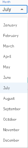
// selectbox ui 적용
<SelectFormControl>
  <InputLabelCustom>Month</InputLabelCustom>
    <SelectBox
      value={currentMonth}
      onMouseOver={handleDropdown}
    >
    {engMonths.map((month, idx) => <MenuItemCustom key={month} value={idx} name={idx}>{month}</MenuItemCustom>)}
	</SelectBox>
</SelectFormControl>
여기서 적용한 selectbox에 scroll css를 추가하고 싶었다. 찾아보니까 select component안에 menuProps라는 프로퍼티를 추가하면 적용이 되는걸 확인했는데 makeStyles를 사용해서 적용하는 방법밖에는 찾을 수 없었다. 문제는 mui에서 제공하는 styled-components와 makeStyles가 css override 충돌이 나서 제대로 적용이 안된다는 점이었다. 이래저래 그냥 js로 이벤트 발생시 해당노드의 style을 제어하는 것으로 스크롤부분을 해결했다.
  <SelectBox
  value={currentYear}
  onMouseOver={handleDropdown} // onMouseOver 이벤트 발생시 handleDropdown function call
>

// 이벤트발생
const handleDropdown = () => {
    const element = document.querySelectorAll(".MuiPaper-root")[0];
    if(element) {
      element.style.height = "200px";
    }
}
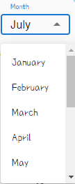
개인적으로 설정한 css 환경에 따라 적용한 방법이라 다른 방법도 더 있을 거라 생각한다.
'JavaScript > React' 카테고리의 다른 글
| React에서 지원하는 DOM 이벤트 (0) | 2022.07.22 |
|---|---|
| React Toggle 사용하기 (0) | 2022.07.12 |
| React custom styling 해보기 (0) | 2022.07.01 |
| window.localstorage (0) | 2022.03.22 |
| react portfolio 완성 (2) | 2022.01.21 |


댓글